
Digital proposal and design specialist, Michelle Wolfswinkel, explains the shift to mobile-first in online learning at Stellenbosch Business School Executive Development (SBS-ED).
With the boom in the digital arena and the increased demand for online learning and the consumption of online content over the last few years, business schools and learning providers have faced the challenge of rapidly transforming. They have also accelerated the migration of learning solutions to the virtual learning world.What does it mean to be “mobile-first”?
“Mobile-first” is essentially a technical term that describes the way in which online content is formatted to respond to the device that is accessing and engaging with it (i.e. desktop computer, laptop, tablet or mobile phone). It is trending globally. Research reveals steadily increasing mobile phone penetration rates, higher demand for exclusively mobile learning content, and impressive mobile learner satisfaction and experience ratings. Being “mobile-first” is a direct driver of responsiveness.
At SBS-ED, digitally-enabled learning occurs in synchronous, remote sessions on Zoom or MS Teams. It also involves asynchronous self-paced online courses, or a combination of these in a blended/hybrid solution. All participants, regardless of the course or program, must access and engage online. They interact via our learner management system hosted on Moodle. As such, in the modality of online learning, mobile phone user interfaces are urged to be prioritised during the design, development, and deployment of online learning. Indeed, South Africa and other African countries are taking note that the online learning mobile-first race is actually being led by India, China, and Malaysia – all developing countries that may be considered less tech-savvy and less likely to need or want mobile, online learning.
Is Stellenbosch Business School Executive Development mobile-first?
Until recently, we assumed that we might not prioritize the mobile learning experience. We thought that participants primarily used desktop computers or laptops to engage with our online learning platform. However, testing revealed that more than 70% of all user interactions with our learning platform in 2022 occurred via a mobile device. Hence the need to prioritise being mobile first!
Embracing mobile, first!
SBS-ED embraces the mobile-first paradigm, with two major changes at the forefront.
1. Designing mobile content
Package learning content in shorter bits, remove tables and columns, and adapt figures and graphs. This ensures an easy, straightforward viewing/learning experience on mobile interfaces. Wordy learning content that requires deep scrolling and runs across various columns is simply not practical on mobile devices. Avoid embedding videos in course content, using expandable resources, and specific quiz formatting. Instead, implement changes such as mobile-friendly viewing in separate tabs and wider access options like downloads to cater to mobile users.
2. Mobile-friendly menu and navigation options
The learning platform benefits from a cleaner look and feel. Tiles that enable seamless mobile selection and navigation enhance the learning experience on mobile devices. Included in this are mobile-friendly hamburger menus, minimal horizontal scrolling, and prominent navigation buttons designed for easy tapping on a phone screen.
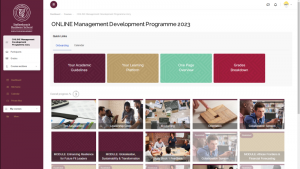
Cleaner, new look online learning platform on Moodle
The mobile experience varies from the desktop counterpart. Desktop interfaces usually provide more horizontal space for menu sidebars alongside learning content, featuring embedded navigation buttons.
Mobile user experience is paramount in online learning design and development for Stellenbosch Business School Executive Development. We look forward to implementing and improving these changes to optimise our online learning experience!
PS. Statistics indicate that you are most likely viewing this content on your mobile device.